2021’s Hottest Design Trends for Inbound Excellence
- Forward-Thinking Custom Illustrations
- Animated Drawings
- Hand-Drawn Illustrations
- In-Your-Face Interstitials
- How Web Designers Can Achieve Success With Interstitials
- Properly Executing Your Interstitials
- Random Shapes
- How Random Shapes Benefit Your Page
- How to Incorporate Random Shapes in Your Web Design
- Hamburger (Mobile) Menus on Desktop
- When Skipping Out Is What Web Design Trends Recommend
- 3D Design Elements
- Moderation Is Key
- Tightening Integration Between Social Media and Website
- How You Can Integrate Social Media in Your Website
- The Correct Way to Call Attention to Social Media Channels
- The End of Autoplaying Media with Sound
- Dark Mode
- Trends May Be Trendy, But…
- Understanding What’s Important to Consumers
- Sticking to Your Guns
In today’s day and age, having a dysfunctional or aesthetically unappealing website simply isn’t an option. The competition for a strong online presence is tough, and it’s getting tougher every day. Those companies that are unable to do so are destined to face a lifetime of uphill battles and difficulty generating profit.
Consumers are now looking for more than just effective services or notable products. They also demand an easy, enjoyable, and memorable online user experience — which usually starts with your website. This should come as no surprise, especially when you consider the heavy reliance on technology for most consumers, be it cell phones, tablets, laptops, or desktop computers.
Whether you’re working with a web designer to start from scratch or revamp an existing website, knowing the best web design trends is key. Understand what consumers prefer when it comes to website design trends, as well as what has been proven to be most effective, will ensure success, from the planning phase all the way to the official rollout.
But how, exactly, can you determine which web design trends your web designer should utilize? The plethora of opinions, suggestions, and trends spanning the world wide web is expansive, and wading through it can feel overwhelming.
There’s no denying that web design is a process that’s constantly evolving and often difficult to keep up with. Once it seems like you’ve gotten a handle on one web design trend, five new ones seem to pop up and dominate.
The key is to focus on what experts anticipate will continue to be popular both now and in the future. Looking to the current year (2021) is an excellent place to start.
For the best results, you need to do two things. Look at what has blossomed over the last year. Then, determine which of those trends are likely to continue thriving once 2022 arrives, as well as the years to come.
Forward-thinking doesn’t just mitigate needless revamps and revisions. It also helps you cultivate a presence online as someone who is always breaking ground on the latest innovations and offerings.
Right now, there are eight practices that are dominating, and it’s looking as those these web design trends will live far beyond the confines of this year. The 8 design trends ruling inbound websites in 2021 are:
- Forward-thinking custom illustrations
- In-your-face interstitials
- Random shapes
- Hamburger (mobile) menus on desktop
- 3D design elements
- Tightening integration between social media and website
- The end of autoplaying media with sound
- Dark mode
In the guide to come, we’ll break down each of these web design trends and explain what you can do to implement them in your own inbound website. That way, by the end of the year, you’ll have an online presence that doesn’t just keep up with the best, but instead far surpasses them.
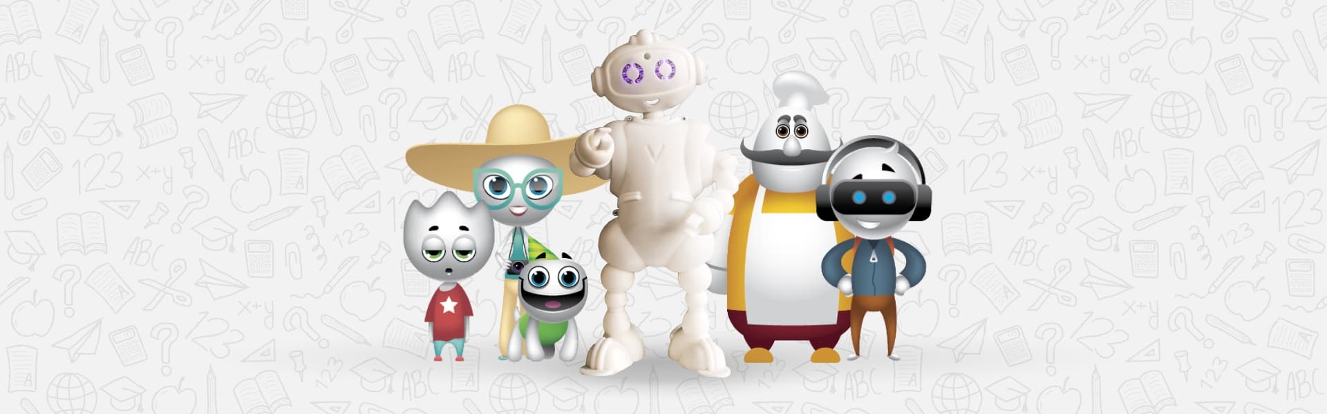
Forward-Thinking Custom Illustrations
Years ago, this type of artwork was confined to the pages of storybooks or paintings hung on a wall. Back then, the only way to add creative content to your website was to upload a photo taken with a camera.
Today, though, technology has made it possible to bring this unique, long-loved art form to the digital screen in the form of a bold new trend.
Businesses have begun using this type of art on their websites to add dimension, personality, and creativity to their web pages. They’ve also started using them to illustrate complex ideas or processes.
For example, a Software as a Service (SaaS) provider might hire an illustrator to create a drawing of a complex user interface to better communicate the intricacies associated with their network offerings.
But the goal here is not to simply utilize the same type of web design trends as everyone else. Instead, this article is meant to guide you to those web design trends that will help bring you out from the background and set your design apart from the crowd in a bold, inspiring way. For this reason, we’re recommending you utilize one of these two forward-thinking custom designs:
Animated Drawings
Interactive animation is one of the web design trends growing most rapidly – and for a good reason. Animated graphics, when used to their best potential, may tell stories, clarify concepts, and assist viewers in navigating a website.
A bit of interactive, graphic, subtle movement on a well-executed drawing or animation can keep the user’s eye engaged and bring bold new life to the web page or mobile screen.
Interactive animations are one of the few web design trends that can be utilized in numerous different ways. For example, web designers might opt to include transitions between web pages, mobile animations, or ones that are triggered by scrolling across the desktop or mobile screen. With the latter, web designers have the animation triggered when visitors start scrolling the mouse horizontally or vertically across the web page, or by moving it over the drawing itself.
These types of interactive, animated pictures are beginning to be seen as far superior to GIFs and videos when it comes to web design trends for brands. This is primarily because a design that features these images will be more unique, more subtle, and have a much faster loading time.
And as any smart page owner knows, the faster their site can load data and elements for their users, the better their websites will be.
But like all other web design trends, if you aren’t careful with how you use them, interactive animations and images can quickly have a detrimental effect on websites. When it comes to this site trend, designers need to be smart and strategic about how they load and are presented to visitors of the website.
The designers make sure they place interactive animations within websites with intent; the idea is to draw the user’s eye to the focal point of the web page. If your designers place it in the wrong spot, it could redirect the attention of your users, so much so that they end up scrolling away from what you actually want them to notice.
Hand-Drawn Illustrations
The second type of custom drawing designers are now using is one that is reminiscent of the load we found in storybooks, as previously mentioned. Hand-drawn pictures, characters, or designs offer a homey, personalized element to company sites, making visitors feel welcome and appreciated.
When used correctly, these elements can humanize your marketing efforts and make users feel closer to you. The personal effect of a drawing that has clearly been created with care fosters a sense of familiarity and comfort in an otherwise impersonal setting.
For example, consider if your design features a micro drawing carefully placed at the top of the site that reminds users of some form of their childhoods. In this example, users would likely feel some form of connection to your design, even before they’ve had a chance to fully search explore your site. This is simply because of the nostalgia of the drawing. This organic connection makes your site feel like home, even at a first glance.
This trend also helps businesses stand out from the crowd. For example, most sites still rely on flashy graphics and digital creations to flesh out their design, even consumers clearly want to search for something more intimate or abstract. Implementing these kinds of drawings on your website will make your website unique and appealing.
In-Your-Face Interstitials
Interstitials, more commonly referred to as pop-ups, have long been considered the bane of the user experience. Today, however, they have a lot more to offer, making them a crucial part of any successful website design.
Traditionally, this type of marketing tactic has been viewed as spammy and annoying, which is why previous website designs have tried to veer away from it as much as possible. But when used tactfully and correctly, they actually serve as an excellent conversion tool.
How Web Designers Can Achieve Success With Interstitials
For example, take the first time a user visits your homepage. This type of action could trigger a beautifully designed interstitial with unique typography and stunning micro gradients. On it, would be data regarding an impressive discount on their first order, so long as they sign up for your newsletter.
By including this triggered action in your website design for when the user first visits, it’s viewed as a natural part of your website journey. If the pop-up was triggered 30 seconds after they arrived, though, it would interrupt their journey of scrolling through your website. This will likely leave them annoyed, confused, and possibly cause them to leave.
Properly Executing Your Interstitials
The placement and execution of this type of pop-up within your website design has everything to do with how successful it is. Consider what you want to accomplish (e.g., notifying them of a sale, asking them to sign up for your newsletter, offering them a discount so they make a purchase, etc.).
Then, think of what type of design would best represent this. For example, if you want to highlight a sale, an interstitial with a flashing animation of the word “SALE” in stunning typography alongside a beautiful image of your products will surely do the trick.
Random Shapes

Finding a background is one of the most challenging parts of creating an inbound web design. Repeated patterned backgrounds like polka dots or stripes, busy gradients, or loud imagery can quickly have the opposite effect of a flat design, overwhelming and cluttering the page.
Conversely, plain colors or gradients may create too much white space (whether literally or metaphorically), or feel too bland or plain to accurately represent the depth and personality of your company. Neither one of these trends elicit the correct response from customers, but the search for the solution is now over.
How Random Shapes Benefit Your Page
The answer: random shapes. Random shapes carefully placed throughout the page cut through that white space or gradients, add depth, visual intrigue, and beauty while keeping the overall web design clean and cohesive. Trends like these are easy to incorporate, so long as you think it through.
How to Incorporate Random Shapes in Your Web Design
The two most common types of elements found on an attractive site include organic shapes (for example, irregular or geometric forms) and amorphous, abstract blobs. Organic shapes are usually associated with minimalism and found on more modern, cutting-edge websites, while a design of abstract blobs and images is considered more playful and whimsical.
The key to this trend is minimalism, intention, and moderation. Place your abstract shapes and imagery with care to elevate a flat design to one that engages the user and capitalizes on all the beauty this trend has to offer.
Hamburger (Mobile) Menus on Desktop
The term “hamburger menu” is a colloquial phrase that has been adopted to reference the common micro design of three horizontal lines used to represent a pop-out or drop-down menu. This web design feature was originally limited to mobile devices and views in an attempt to limit data use, save screen space and make the user’s view easier to navigate.
In 2021, though, more companies are opting to utilize this web design on desktop views, as well. While this might seem like a smart step for most websites, implementing these elements on your page or site can actually have damaging results.
When Skipping Out Is What Web Design Trends Recommend
This is one of the few mobile trends that don’t actually translate well to a larger technology form. This might include devices like large tables, desktop computers, or laptops.
Features like a small, simple design to access a menu make sense on mobile devices, where space is limited. But on a desktop screen, little features or icons like a micro menu can quickly get lost, making it difficult for users to access your most important links.
Instead, have your designer look for a more engaging form of symbols that indicate a menu. Simple buttons with clear labels may seem to most like minimalism.
But when sites feature these same buttons, but with, eye-catching fonts that stand out from the background, the effects are spectacular. Not only will they save space while also making it easy for your users to find what they are looking for.
3D Design Elements
In 2021, cutting-edge inbound websites are employing 3D graphics and visual effects in an effort to break out from the flat design style that has become prevalent in recent web design.
The right three-dimensional visual will add depth and appear to leap off the page, serving as an effective eye-catcher that grabs the viewer’s attention and directs their view. It might be as simple as adding shadows to custom fonts or illustrations or making a navigation bar button appear raised to incorporate an isometric web design.
Moderation Is Key
It’s easy to get carried away asking your web designers to incorporate a bunch of isometric web designs once you get started. You don’t need to aim for complete minimalism. But too much of this feature can quickly make the page look cluttered and overly busy, detracting from the visual appeal of the site.
Focus on having your web designers implement them in focal spots of the website; this will ensure the viewer’s attention is drawn exactly where it needs to be to garner a sale or conversion.
Tightening Integration Between Social Media and Website

Part of creating a compelling, reputable, and well-received brand is ensuring consistency across all your platforms and forms of technology.
Marketing teams focus on generating recognition, and the best way to do that is to make all your brand elements easy to identify at a glance. Furthermore, you want to ensure your users can easily access each of your channels without a disjointed or complicated journey between them.
For this reason, streamlined integration between social media across all forms of technology and devices is rapidly becoming popular in 2021.
Not only does this help with marketing efforts, since it brings attention to additional channels, but it further emphasizes the consistency of your business everywhere.
How You Can Integrate Social Media in Your Website
One way of achieving this goal features an ever-updating live feed of your social media channels directly on the website. This may include the most recent images from your Instagram or videos shared on your YouTube.
Another effective way of integrating these two channels is by providing easily distinguished and located icons that link directly to your pages. Avoid using fonts or custom typography to draw attention to the links.
The Correct Way to Call Attention to Social Media Channels
Instead, use the platform’s own icons, fonts, or typography, so customers will recognize them more easily and click on them faster. For example, rather than creating a button with your own font or typography labeled “Facebook,” opt to include a simple image of the well-known “F” that represents the company.
Just make sure that clicking on either the images or the links directs the user to the profiles in a new window. Otherwise, they’ll be directed away from your website, which could interrupt the process of a sale or conversion.
The End of Autoplaying Media with Sound
Video is, without a doubt, one of the most engaging forms of web media. Images are great, but videos offer a bold, load of animation to websites, making the users experience more memorable and engaging.
However, it is undesirable when video sound begins playing automatically as soon as a webpage loads. Not only does this startle the user, as they are likely not expecting the video sound, but it could put them in an uncomfortable position.
For example, if they are sitting in a quiet waiting room before an appointment, and the video autoplay goes off and disrupts the environment, it could lead the user to have a negative connotation regarding your website.
In 2021, trends indicate it’s crucial that every brand do away with all instances of autoplaying video with sound. This doesn’t mean that you should host a video on your website; in fact, it’s important that you continue to do so, as this is one of the most engaging trends of media and helps to increase SEO value.
Instead, modify your web and mobile design. Simply adjust the video settings so that they only play once a user has clicked on them.
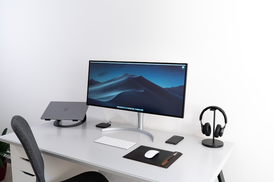
Dark Mode

In September of 2019, Apple introduced “dark mode” to iOS, and the expectations for user experience were forever changed. This bold style simply inverts the typical light/dark monitor layout. It uses a light text and image on a dark mobile or desktop backdrop rather than a dark text and image on a light background.
According to research, nearly 90% of all device users opt for dark mode when available. Of those who prefer to see a page in this format, almost all state that it’s because this design adjustment is easier on their eyes, leading to a more accessible and favorable user experience. With this type of design, elements, animations, video, and features are better viewed by customers.
With such a substantial amount of positive feedback and buy-in surrounding this kind of design, it’s easy to see why the best designers in 2021 have told brands dark setups should top their lists of the best web design trends to incorporate. And we can likely expect to see this become completely adopted in the years to come.
Trends May Be Trendy, But…
There’s no denying that keeping up with the web design trends for 2021 is crucial to maintain a competitive edge. If you don’t recognize and utilize these website design trends on your own pages, you’ll quickly get left behind as competitors revamp and adjust their websites to match what is “in.”
However, it’s even more important to maintain an authentic, natural, and engaging online presence.
Understanding What’s Important to Consumers
You should never sacrifice the true nature of your business or brand in order to keep up with the latest or most popular web design trends for 2021. Understand what visitors expect to see doesn’t always mean it’s what they should see on your particular page. Consumers can quickly and easily tell when a business is trying to be something it is not.
Sticking to Your Guns
If you’ve created a website that doesn’t paint an accurate picture of your enterprise, they’re far more likely to judge you negatively for being inauthentic than they are for failing to incorporate a popular web design trend. So if a particular web design trend simply doesn’t jive with how you identify your business, stick to your guns. Stay true to who you are and create an inbound website that authentically represents you.
By creating a careful balance between authenticity and trend implementation, you’ll end up with a beautiful, functional, and appealing website users love to utilize.