The Web Design Revolution of 2023: Unpacking the Trends Shaping the Digital Future
- Intro
- The Reign of Responsive Design and Mobile-First Strategy
- Embracing the Dark Side: The Rise of Dark Mode
- AI and Machine Learning: The New Power Couple in Web Design
- Web3 and Blockchain: The Dawn of a New Design Era
- The VR and AR Invasion: The New Reality of Web Design
- The Classical Rebirth: The Return of Serif Fonts
- A Splash of Color: Bold, Saturated Hues Take Center Stage
- Soft Shadows and Floating Elements: Elevating Web Aesthetics to New Heights
- Neumorphism: Breathing Life into Web Design
- The Magic of Micro-Animations: Enhancing User Engagement
- Sustainability and Web Design: Creating a Greener Digital World
- Voice User Interface (VUI) and Accessibility: Speaking the Language of Inclusive Design
- Outro
Intro
As we stand at the midpoint of 2023, it is the perfect time to take a step back, reflect on the trends that have emerged so far, and project how they might evolve in the coming months. Conducting this analysis midway through the year allows us to provide timely insights to guide strategic decisions for the remainder of the year and beyond. It’s about understanding the direction in which the digital world is moving, identifying the innovations that resonate with users, and anticipating how they might shape the future.
These web design trends, while defining the digital landscape of 2023, are not fleeting phenomena. They represent a broader shift in how we perceive and interact with the digital world, indicative of deeper changes in technology, aesthetics, and user expectations. As we look ahead, it’s clear that these trends are poised to influence not just the remainder of this year but extend their reach into 2024 and beyond. They are laying the groundwork for the future of web design, pointing us toward a more immersive, accessible, and sustainable digital world that values user experience and aesthetic innovation in equal measure. So let’s delve in and explore the dynamic trends transforming the face of web design.
The Reign of Responsive Design and Mobile-First Strategy
In the midst of a mobile revolution, responsive design has emerged as more than just an option—it has become the lifeblood of modern web design. Guided by the mobile-first approach, designers now place small screens at the forefront of their design strategy, with scalability to larger devices following suit. As we venture into the era of digital mobility, these trends are not merely surviving; they’re thriving, shaping the narrative of web design in 2023 and beyond.
Responsive design has become an indispensable aspect of creating websites that adapt seamlessly to various screen sizes and devices. With the diverse range of smartphones, tablets, and other portable devices, ensuring optimal user experiences across multiple platforms has become paramount. Responsive design empowers designers to craft websites that fluidly adjust their layout, typography, and visual elements, guaranteeing consistent functionality and readability regardless of the screen being used.
Driving the responsive design movement is the mobile-first approach. By prioritizing the design and development of the mobile version of a website, designers ensure that the core content and user interactions are finely optimized for smaller screens. This approach compels designers to carefully scrutinize every element and prioritize essential features, streamlining the user experience and fostering engagement. From there, the design can be expanded and enhanced for larger screens, capitalizing on the additional real estate without sacrificing usability.
In the era of digital mobility, responsive design, and the mobile-first strategy are not merely surviving; they are thriving and shaping the landscape of web design. With the ever-increasing dominance of mobile devices as the primary access point to the digital realm, these strategies have become indispensable in delivering seamless and engaging user experiences. They empower businesses and individuals alike to effectively reach and captivate their target audiences, regardless of the devices they use.
Looking ahead, responsive design and the mobile-first approach will continue to evolve and adapt as technology progresses. As new devices, screen sizes, and interaction patterns emerge, designers will embrace the challenge of crafting innovative and intuitive experiences. By remaining at the forefront of these trends, web design in 2023 and beyond will further optimize user engagement and adaptability, enabling websites to thrive in the dynamic digital landscape.
Embracing responsive design and the mobile-first strategy is not merely a choice; it is imperative for web designers and businesses seeking to deliver exceptional experiences in the mobile-driven world we inhabit. With their unwavering relevance and constant evolution, these trends will undoubtedly shape the future of web design for years to come.
Embracing the Dark Side: The Rise of Dark Mode
No longer just a user preference or a fleeting trend, dark mode has etched itself into the core of web design. The dynamic, stylish aesthetic it brings to the digital space has become a beacon of sophistication. As dark mode illuminates the web design realm, it showcases its appeal like never before.
This feature has morphed from its initial roles of reducing eye strain and conserving battery life, now forming an integral part of the web design’s visual language. Its sleek, mysterious charm enthralls users, with the contrasting dark backgrounds and vibrant elements concocting an enchanting user experience.
At its heart, dark mode enhances content visibility and readability. Light-colored typography against a dark backdrop, combined with carefully placed accents, ensures information clarity. Coupled with the integration of dark backgrounds, subtle gradients, and minimalist design elements, it creates a captivating, modern aesthetic that adds depth and dimension to the user interface.
Dark mode’s elegance and sophistication have bolstered its popularity, providing an ambiance reminiscent of a high-end environment. Its sleekness allows users to focus on the content, free of distractions. Adaptable and versatile, dark mode is a favorite choice across websites, mobile apps, operating systems, and social media platforms.
In the ever-evolving landscape of web design, dark mode stands tall, a dominant force that leaves a lasting impression on users. The rise of dark mode signifies a shift towards more expressive, bold design choices. By embracing the allure of the shadows, web design ventures into a new realm of possibilities, captivating users and elevating digital sophistication to new heights. With dark mode, web design transcends the light, revealing a whole new spectrum of design potential.
AI and Machine Learning: The New Power Couple in Web Design
AI and Machine Learning are making their indelible mark in the web design sphere, infusing user experience with a touch of predictive intelligence that borders on digital prescience. This formidable tech duo is revolutionizing the design workflow and user engagement.
AI and Machine Learning bring to the table an unprecedented level of personalization, leveraging vast data repositories to tailor user experiences to individual preferences and behaviors. The outcome? A digital experience that is as unique as the user’s digital fingerprint. Websites are becoming intuitive, predictive, and responsive to a degree that elevates user engagement to new heights.
But the power of AI and Machine Learning extends beyond enhancing user experiences. They are also making waves in the design process itself. From AI-driven design tools that streamline workflows to machine learning algorithms that refine user interfaces based on user feedback, this power couple is making the design process more efficient and insightful.
AI and Machine Learning are not just visions of the future—they’re the energizing life force of contemporary web design, reshaping how we create and interact with the digital world. The AI revolution is here, and it’s injecting web design with a dose of intelligence that’s elevating user experience and design process to uncharted realms.
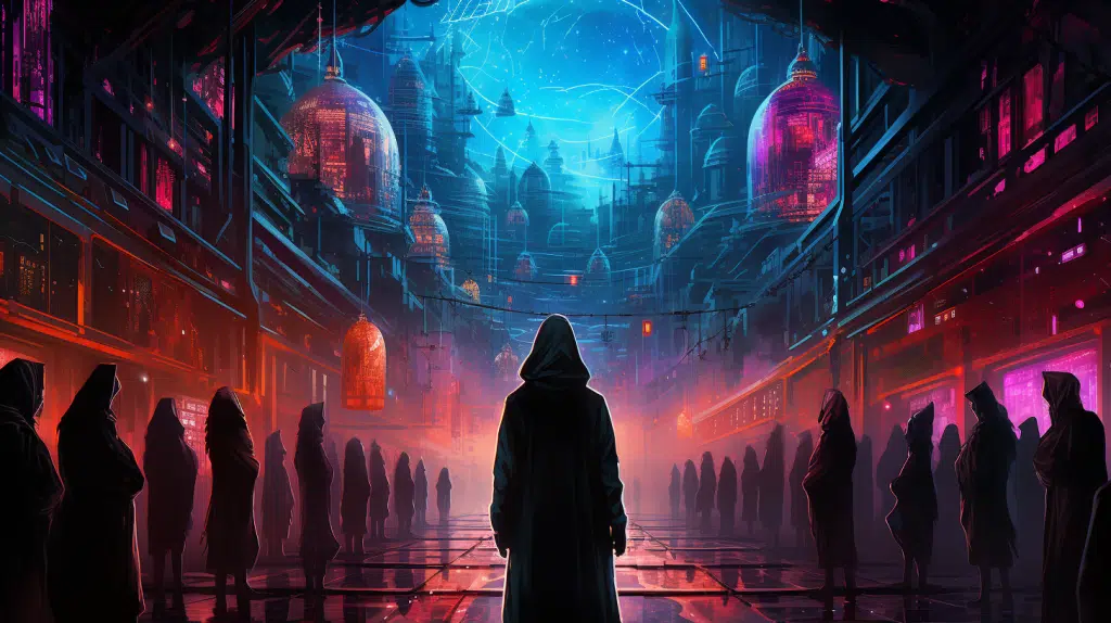
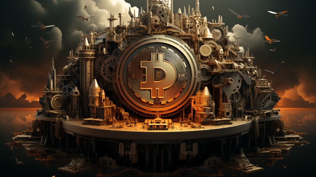
Web3 and Blockchain: The Dawn of a New Design Era
As we delve deeper into the digital epoch, web design is stepping into the trailblazing domains of Web3 and blockchain technology. The integration of decentralized elements into web design is no longer a distant concept—it’s here, and it’s revolutionizing our interaction with the digital world.
This transformation is being driven by Decentralized Applications, or DApps. Built on blockchain technology, they offer a new level of transparency, security, and user empowerment—attributes that are gradually becoming integral to modern web design principles. These DApps are shifting control back into the hands of users, paving the way for a more democratic digital space.
In addition, the burgeoning world of cryptocurrencies is influencing web design in significant ways. With crypto transactions becoming commonplace, websites are adapting to incorporate seamless crypto payment integrations, resulting in a more versatile and inclusive digital financial ecosystem.
NFT marketplaces, too, are becoming central to web design. These platforms demand a high level of security, transparency, and user-friendliness—pushing designers to innovate and implement new design strategies that cater to the unique needs of blockchain technology.
The dawn of this new era marks the emergence of a novel design landscape, where the decentralized tenets of Web3 and blockchain reign supreme. It’s an evolution that goes beyond mere aesthetic trends—it’s a shift in the very fabric of web design, one that prioritizes security, transparency, and user empowerment.
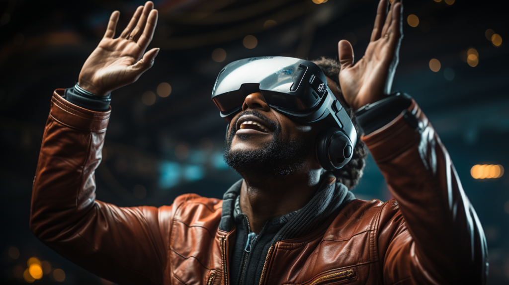
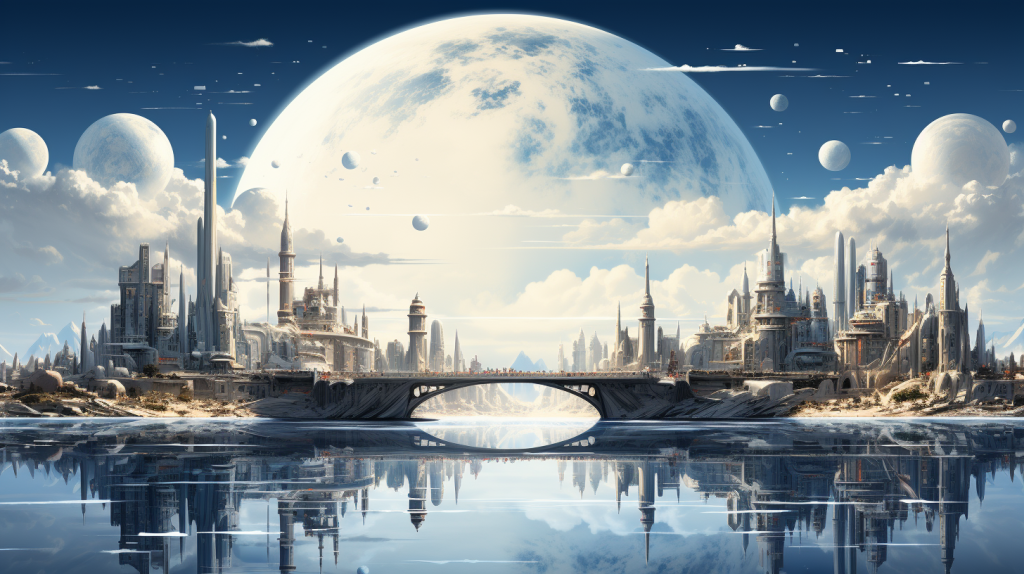
The VR and AR Invasion: The New Reality of Web Design
The web design canvas is expanding beyond the confines of the screen and diving into the realms of Virtual Reality (VR) and Augmented Reality (AR). These groundbreaking technologies are redefining the boundaries of user experience, ushering us into an era of immersive digital interaction that transcends reality as we know it.
Gone are the days when interaction was confined to mouse clicks and screen swipes. VR and AR create a digital universe you can walk through, reach out and touch, and even interact with in real time. These technologies transform web design from a static two-dimensional medium into a dynamic, three-dimensional journey.
The VR and AR revolution is redefining traditional user interfaces, creating a new reality that extends far beyond the screen. Users are no longer passive spectators—they are active participants, interacting with digital content in an immersive environment.
But the true power of VR and AR in web design lies in their capacity to create worlds. They are not just tools for enhancing the user experience; they are catalysts for crafting interactive digital universes, each tailored to offer a unique, immersive journey that captivates the user.
Incorporating VR and AR into web design is not merely following a trend—it’s shaping the future of digital interaction. As we move forward, web design is evolving beyond creating experiences—it’s venturing into the realm of world-building, crafting immersive environments that revolutionize how users engage with digital content. Get ready to step into a new dimension of web design, where the digital and physical realities converge.
The Classical Rebirth: The Return of Serif Fonts
In an intriguing turn of digital trends, nostalgia is sweeping the design world, while serif fonts are making a noteworthy comeback. Merging the timeless allure of the ’80s and ’90s with the sophistication of classical typography, this trend reshapes the web design panorama, infusing it with classic charm and modern innovation.
Serif fonts, renowned for their elegant strokes and refined structure, have long been associated with tradition and trustworthiness. Now, they are resurfacing in web design, not just to evoke nostalgia but as a strategic move to balance sleek modernity with the warmth and familiarity of classical design.
This seamless blend of old-world charm and contemporary aesthetics creates a captivating fusion. Serif fonts are breaking free from their conventional domain and transcending the printed page. They grace website headers, accentuate text, and enhance readability. By providing an alternative to the clean lines of sans-serif typography, they infuse the digital text with elegance, sophistication, and a human touch.
The rebirth of serif fonts in web design signifies more than a passing trend. It showcases the cyclical nature of design, where the past and the present interact and evolve together. By evoking a feeling of nostalgia for past times, brands can highlight their values in a subtle way that resonates deeply with customers. This resurgence, combined with the nostalgic trend, is not only transforming web typography but also enabling brands to communicate their core values authentically. A common technique employed in web design is the integration of classic color schemes, fonts, and imagery that evoke themes that have stood the test of time. This deliberate incorporation of nostalgic elements delivers a powerful fusion of tradition and innovation, elevating the overall aesthetic and user experience to new heights.
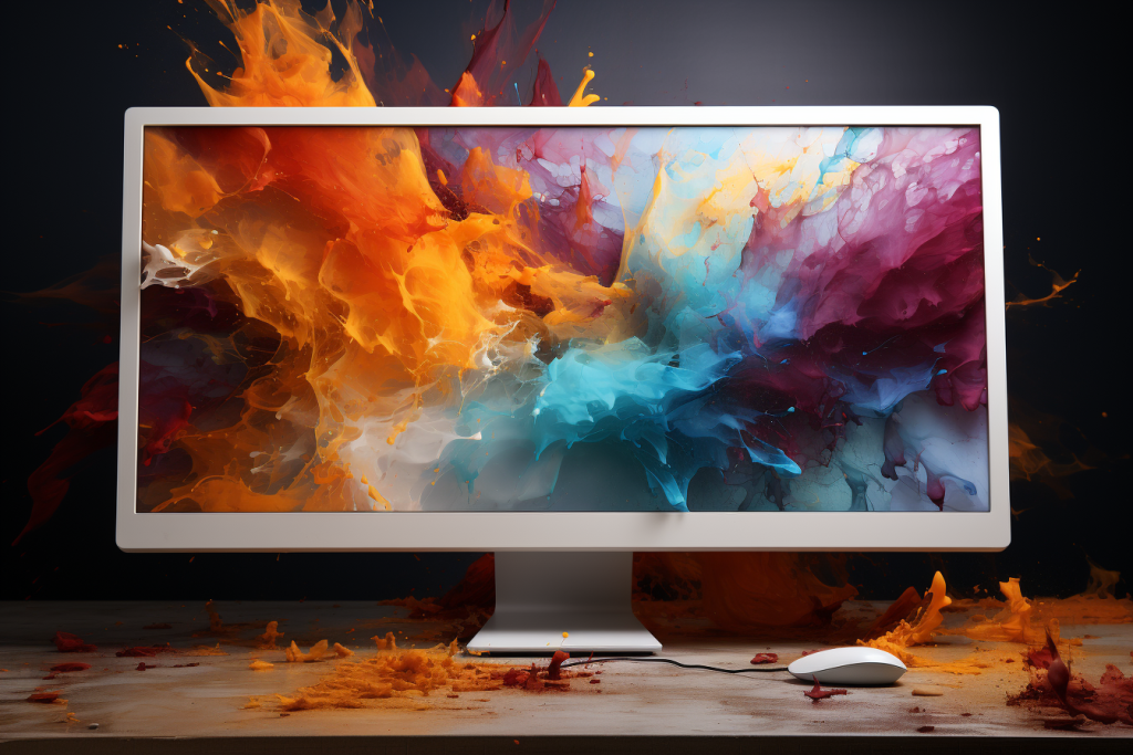
A Splash of Color: Bold, Saturated Hues Take Center Stage
The digital world is undergoing a vibrant transformation. Bold, saturated colors are storming the stage, infusing the web design arena with a daring vibrancy that commands attention and captivates users.
This isn’t a subtle suggestion of color—it’s a full-on embrace of audacious hues, a riotous explosion of colors that breathe life and personality into the digital landscape. Vibrant reds, electric blues, sunny yellows, and radiant purples are painting the digital canvas, stimulating user engagement and leaving an indelible impact.
But these vivacious colors aren’t just design elements that please the eye—they are transformative tools that communicate emotions, set the mood, and tell compelling brand stories. They are the charismatic protagonists that turn the digital narrative into a captivating visual symphony.
These vivid hues make interfaces pop, buttons stand out, and CTAs more compelling. They are inviting users to interact, to engage, to explore. Bold and saturated colors are no longer just trends—they are shaping the very aesthetics of the web, turning websites into vibrant digital canvases that resonate with users and reflect the brand’s unique personality.
Web design has become a more colorful realm—a place where bold, saturated hues have taken center stage, sparking life, excitement, and emotion in the digital narrative. Get ready for a bold and colorful journey in this vibrant digital era.
Soft Shadows and Floating Elements: Elevating Web Aesthetics to New Heights
Gravity-defying elements have taken center stage in web design. The increasing incorporation of soft shadows and floating elements is redefining the visual language of websites, launching web aesthetics into an exciting dimension.
Soft shadows are moving away from harsh, dramatic effects to a more subtle, refined approach, providing a gentler transition and an enhanced sense of depth. This effect adds a realistic touch to the elements, providing a visual hierarchy that intuitively guides the user’s eye across the page.
Similarly, floating elements are revolutionizing web aesthetics by breaking free from the constraints of traditional layouts. These elements, be it text, images, or even buttons, hover above the background, adding depth and dynamism to the overall design. They evoke a sense of lightness and movement, creating an interactive and engaging user experience.
These innovative design techniques breathe life into the digital landscape, making websites not only visually more appealing but also more intuitive and immersive. Instead of a flat, two-dimensional plane, the web has become a vibrant, three-dimensional space teeming with depth and movement.
In the world of web design, the flat design trend is slowly giving way to these new, exciting techniques. Soft shadows and floating elements are not merely passing trends; they represent the evolution of web aesthetics, taking user experience to unparalleled heights. Welcome to a future where the third dimension reigns supreme.
Neumorphism: Breathing Life into Web Design
One of the most captivating trends in web design today, Neumorphism, is bridging the gap between reality and the digital realm, blurring the lines in a truly transformational way. This design aesthetic, characterized by its unique approach to emulate real-world properties, is revolutionizing the look and feel of our digital interactions.
Neumorphism breathes life into web design by integrating a tactile-like experience into the digital sphere. It offers a semi-realistic visualization, combining flat design and realism, to make digital elements appear as physical objects in the real world. Think of soft shadows creating a sense of depth, gradient colors offering a tactile sense, and skeuomorphic details lending an element of familiarity.
These subtle design manipulations deliver a dynamic, engaging user experience that feels not just visually pleasing, but intuitive and immersive. It’s like having the tangible experience of holding a product or flipping a switch, except, in the vast, boundless digital landscape.
Moreover, Neumorphism opens up a new realm of possibilities for digital storytelling. Combining familiar real-world cues with a novel digital representation adds a compelling dimension to brand narratives, enhancing user engagement and connection. Whether it’s an eCommerce platform simulating the experience of a physical store or a digital product offering a semblance of tangible interaction, Neumorphism is transforming how users perceive and interact with the web.
Neumorphism, with its innovative blend of the physical and digital, offers an unprecedented level of user engagement. It truly breathes life into web design, promising an intuitive and enriching user experience that could reshape the digital world’s future.
The Magic of Micro-Animations: Enhancing User Engagement
In 2023, web design has found its secret weapon for boosting user engagement: micro-animations. These subtle motion elements, ranging from pulsating buttons to transition effects, serve as our digital guide, bringing life to static web pages and making them more interactive and user-friendly.
This year, micro-animations have taken center stage in web design. Advanced technologies have enabled these tiny animations to become more refined, transforming from optional flourishes to crucial parts of the user experience. They provide real-time interaction feedback, build anticipation, and can even narrate a brand story, making everyday browsing a unique digital journey.
Micro-animations also serve as brand ambassadors, subtly embedding brand personality within a website. This functionality has seen extensive use across various platforms, from eCommerce sites using them for product interaction to narrative websites for story progression.
Sustainability and Web Design: Creating a Greener Digital World
The digital world is experiencing a wave of environmental consciousness. Amid a shift towards greener practices, web design is not left behind, with an increasing emphasis on low-energy-consuming websites.
In a realm where performance and aesthetics typically reign supreme, sustainability has often been sidelined. However, eco-conscious practices are now coming into focus in web design. Low-energy websites, reduced data transfer, and energy-efficient coding practices are being adopted, aiming to minimize the carbon footprint while enhancing website performance and accessibility.
Furthermore, sustainable practices are making their mark on web design aesthetics. Dark-mode interfaces, known to reduce screen energy consumption, along with minimalist designs that require less data transfer, are prominent examples. This convergence of functionality, aesthetics, and sustainability leads the way toward a greener digital world.
Voice User Interface (VUI) and Accessibility: Speaking the Language of Inclusive Design
The rise of Voice User Interface (VUI) and an intensified emphasis on accessibility are redefining the landscape of web design.
VUI technology, which enables users to engage with websites via voice commands, is catalyzing a revolution in user interface design. This powerful tool is opening up digital spaces to users with diverse abilities, heralding a new era of inclusive web design.
Simultaneously, web designers are placing an elevated emphasis on accessibility. Design strategies like color contrast enhancement for better readability and the development of keyboard-friendly navigation for users unable to use a mouse are becoming more prominent. This shift underscores the industry’s commitment to fostering a digital world that is accessible and inclusive for all users.

Outro
In this dynamic era of digital transformation, innovative web design trends are reshaping the industry, sparking a revolution that harmoniously blends aesthetics, functionality, creativity, and technology. This landscape is a testament to the boundless potential digital innovation continues to unveil, marking an exciting era of intuitive, inclusive, and inspiring digital experiences.
However, crafting such a distinctive digital space is more than following trends. It’s about creating an environment that reflects your brand, connects with your audience, and leaves a positive impact. It’s about navigating the rapid pace of change and exploiting the full potential of these emerging trends. That’s where a reliable, experienced partner steps in.
With a rich legacy of delivering cutting-edge web solutions, we merge the artistry of design with the power of technology to create experiences that resonate. We believe your website is more than just a digital presence—it’s your platform to tell your story, engage your audience, and grow your brand.
The web design landscape is shifting at a breakneck pace. By choosing the right partner for your digital journey, you’re set not just to keep up with the changes but to lead them. Let’s bring your vision to life together, embracing the future of web design, and prepare for an exhilarating journey into the future of digital innovation. Are you ready?


