Layout Grids
What is a Grid?
In the world of design, grids are like invisible guides that help create a harmonious and well-structured layout. They are the backbone that divides the page into columns and modules, providing a framework to arrange elements with precision and balance. While these lines may not always be visible, their presence ensures that everything on the page aligns seamlessly. Think of grids as your secret weapon to bring order and elegance to your designs.
Why Do We Use Grids?
Grids are the cornerstone of creating interfaces that are both visually appealing and user-friendly. With countless variations available, designers can customize grids to suit the specific needs of their content. Our preference is a versatile 12-column grid, but the beauty of grids lies in their adaptability. Feel free to explore different formats and find what works best for you. After all, the ultimate goal is to simplify the layout process and bring your creative vision to life.
Baseline Grid
In the realm of print design, the baseline grid reigns supreme. It establishes a vertical rhythm, creating a sense of order and consistency within typography and page elements. This invisible structure has remarkable benefits:
- Precise vertical spacing, eliminating the guesswork
- Visual alignment of elements across multiple columns
- Harmony between different design elements and typography
- Consistency and cohesion throughout multiple pages
- Streamlined collaboration between designers and developers
The baseline grid gives your work the desired cohesion and balance, ensuring every element falls into place. It adds a touch of crispness and sleekness, creating that indescribable allure that captivates your audience.
Our recommendation? Use a vertical pitch of 4px for your grid. While the popular 8px grid has its merits, denser interfaces require greater precision. By sticking to a 4px grid, you gain the necessary granularity to achieve meticulous designs.
Desktop design tools have fairly dense interfaces when optimized for productivity and speed. With such a dense interface, an 8px scale doesn’t provide enough granularity.
Every value should be divisible by four, including element sizes (images, fields, tables, buttons, etc.), margins, paddings, and line heights, except for the font sizes and icons, as making them a multiple of four may negatively affect their look. Our grid is definitely on the more granular end of the scale, especially compared to the 8px grid included within many modern marketing websites. Building denser interfaces requires a high level of fidelity, a fidelity provided by a more granular grid.
Tailor-Made Grid Solutions
Experience has taught us valuable lessons in the world of grids. We have fine-tuned our process, honed our layouts, and created our own proprietary grids that serve as a reliable starting point. Our designs draw inspiration from the Bootstrap 12-column grid, the Muller-Brockmann modular systems, and Chihold’s studies on grid usage in typography. Each resolution-specific grid is meticulously crafted to suit different screen sizes, ensuring optimal performance. Here’s a glimpse into our customized solution:
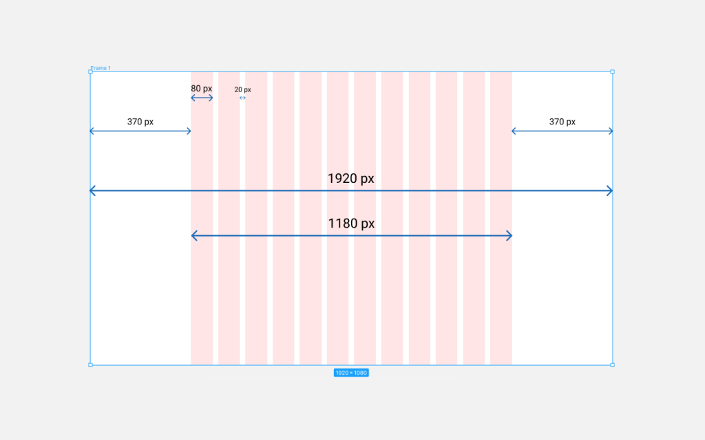
1920px resolution
- 12-column grid
- Side margins: 370px
- Content Area Width: 1180px
- Column width: 80px
- Column spacing: 20px
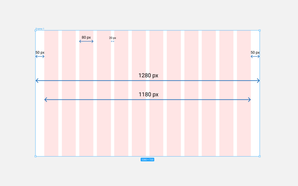
1280px Resolution
- 12-column grid
- Side margins: 50px
- Content Area Width: 1180px
- Column width: 80px
- Column spacing: 20px
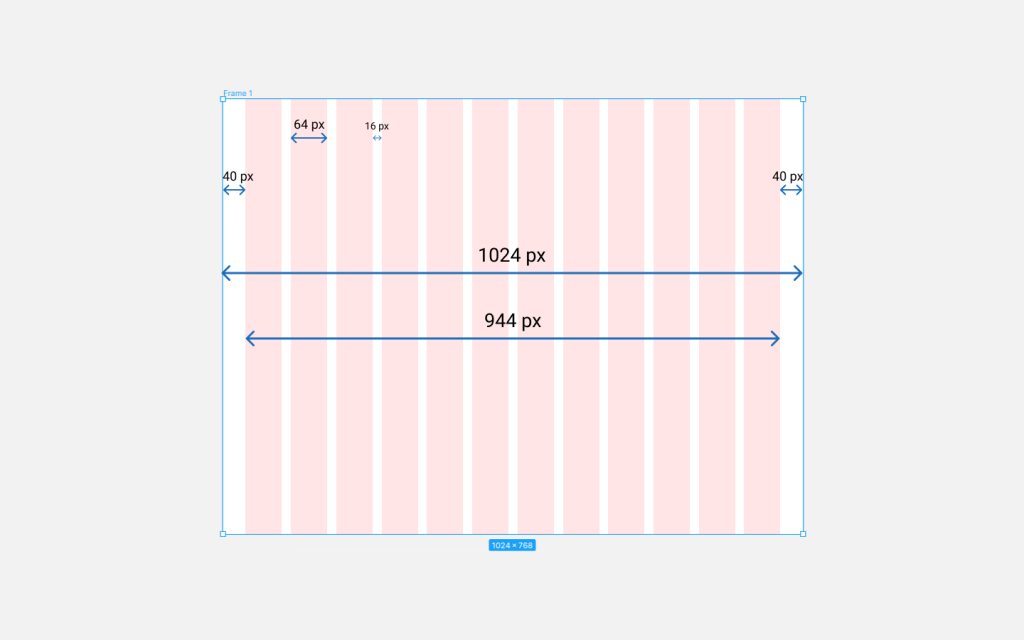
1024px Resolution
- 12-column grid
- Side margins: 40px
- Content Area Width: 944px
- Column width: 64px
- Column spacing: 16px
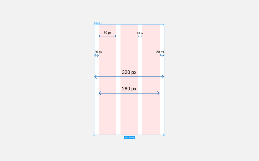
320px Resolution
- 3-column grid
- Side margins: 20px
- Content Area Width: 280px
- Column width: 80px
- Column spacing: 20px
Emulating Nature’s Beauty
The 320px grid is built around the 12-column Bootstrap grid but tailored after the iOS design guideline. These templates offer an intuitive layout for a web page while keeping it versatile enough for screen sizes with different resolutions. There are far too many devices of various sizes and categories to tailor a customized grid to every alternative, so we use this tool as the baseline and work down from there. Feel free to use this tool that will make customizing your layouts second nature.
The arrangement of elements in these grid designs is modeled after a common mathematical sequence that appears in nature often, called the Fibonacci Sequence. The Fibonacci Sequence is a phenomenon where each number in the sequence is the sum of the previous two (1, 1, 2, 3, 5, 8, and so on). Fibonacci discovered this same sequence in various cases throughout nature: in various seashells, flowers, etc.
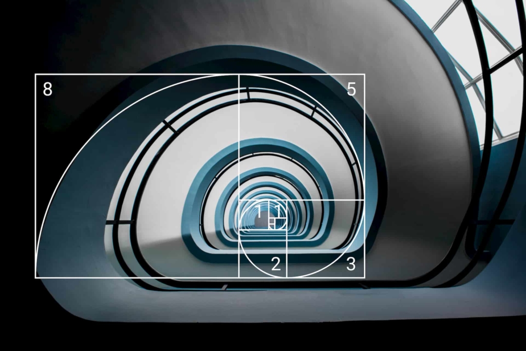
Some of the most beautiful patterns in nature follow the Fibonacci Sequence. Because the sequence mirrors nature, the human senses are trained to naturally emulate the similarity to find beauty when we see things proportioned. The same principle applies to grid systems. They provide an effective and appealing format for organizing design elements on interfaces.


