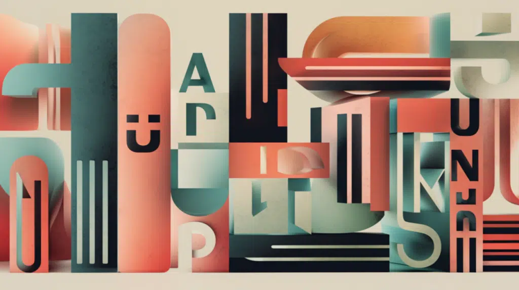
Digital Typography
Typography is the bread and butter that ties together each of the visual aspects for a clean, professional, dynamic-looking interface. It is what adds extra polish to give your interface a sharp, sophisticated touch. You may have brilliant animations and award-winning graphic elements, but if the fonts on your site are illegible, the essence of your interface may be lost. You need to ensure you don’t lose any valuable conceptual understanding you have just worked so hard to achieve. Attention-spans are shorter than ever in the modern age, calling for concise, crisp, legible typography.
It’s easy to get carried away when deciding on a typography layout for your site, but in most cases, the simpler the design, the more successful you’ll be. Typography should be visually pleasing and attention-grabbing, but its primary purpose is to act as a vehicle for the information you’re trying to convey—the more persuasive your website, the higher your conversion rate. Typography plays a large but often overlooked role in the conversion of clicks into generated sales.
Typography that Works
How do we approach typography? Glad you asked. We follow the time-tested, proven techniques to garner typographical success based on our years of experience. The creative industry is constantly in motion with new products, software, approaches launching daily, so why, you ask, do you defer back to older systems? In any creative discipline, new doesn’t necessarily mean better. We go with what we trust, what we have factual documentation for. We say “time-tested” here intentionally to convey the message that if a technique has been working for 50 years, it’s safe to assume that it works. Simultaneously, the latest software release that made the covers of all big magazines has not been tested or proven. Why risk resources that don’t belong to you? Enough said.
What exactly is the premise we base our typography designs on? The golden rule is to make sure your heading easily and naturally contrasts with your body text. We do this either by contrasting font pairs or deploying differences in sizing. Regardless, the effect is the same. What happens here is the contrast draws greater attention to the heading, which emphasizes the purpose of the content. Essentially, it acts as a hook for readers, naturally pulling them into your web copy.
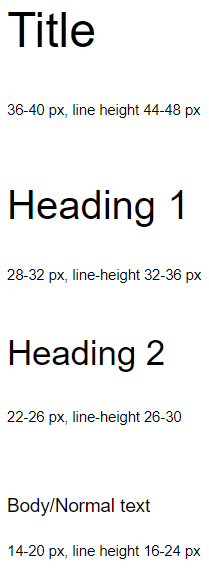
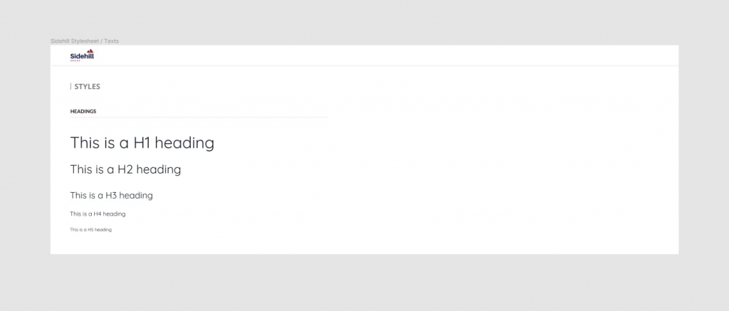
The best typography is structured and organized. There should be a clear and consistent hierarchy of text styles and sizes that run consistently through your site. It will vary depending on the site, but as an example, the following typically works:
- Title
- Subtitle
- Body copy
- Additional text
- Label
- Button
As long as you identify the rules and then consistently stick to them, you’ll be fine. Body copy, which will likely be the bulk of your typography, should be organized by subject matter to be clear and concise. Paragraphs should be separated by ideas and concepts to keep the natural flow of information. Not only is this best for the reader, but it also helps maximize search engine optimization as well.
Font Formats
As a point of reference, it is important to note the various types of font formats. They differ in each render methodology and purpose, with some made specifically for the web and others exclusively for cutting machines.
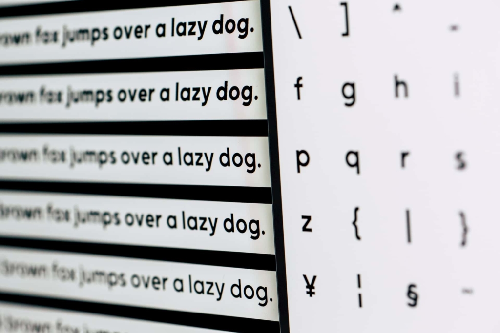
While there are many different font formats available online, there are six used most prevalently. When purchasing a new font online, you will find that it will be available in one or more of the following types:
- OTF (OpenType - .otf): OpenType is the next generation of TrueType (.ttf). It is the format that contains all the extra goodies, embellishments, swashes and alternates, all the swirly lines on numbers and letters that you could ever think of. Given that it is the most updated of all the formats, it includes all the most up-to-date features and functionalities.
- TTF (TrueType - .ttf): TrueType fonts are the basic fonts created by Apple and Microsoft. While they work fairly perfectly almost everywhere, there are some limitations on the extra functionalities that can be used, which is exactly why OpenType was created. If for some reason, you don’t have OpenType available with your font package, we recommend you install the TrueType font.
- SVG (.svg): SVG Fonts that come with the downloadable font packages are only suitable for the web, it is not available for crafting or cutting machines.
- EOT (Embedded Open Type - .eot) the EOT format is meant exclusively for the web and is only supported by Internet Explorer as Microsoft created it. It is not plausible to use for any type of crafting.
- WOFF/WOFF2 (Web Open Font Format - .woff/.woff2): Woff and Woff2 files are rendered useless if you want to do something with them for your cutting machine. They do work in all browsers but will not work in graphics software such as Cricut Design Space, Adobe Illustrator, Silhouette Studio, etc. They are created for the web and are OpenType fonts and TrueType fonts with some extra features and in compressed format.
According to The Ultimate Font Guide, the OTF file (OpenTypeFont) will always be your best bet. If unavailable for some reason, the second choice should be TTF File (TrueType font). Contrary to popular belief, it is understood that SVG files are what works best with cutting and embroidery machines. However, SVG file formats downloaded with fonts are different from when you buy cut-ready files, so be careful not to make this same mistake. Similarly, when you are shopping with Etsy, you might also see SVG fonts, but they are not installable font files but a folder with all the letters saved in different formats.
Font Pairs
If you intend to invest in a future within the design domain, understanding font pairs will require more than just a brief notion. Pairing appropriate fonts can make or break not only just the design of your new product but also the entire project. It’s no secret the number of new fonts released each day is simply astounding. No one could be expected to remember some, let alone all potential font combinations.
By font pair, we mean a title and body-text fonts. Together they form a font pair. To simplify the font pairing process, it shall be known that three primary types of relationships exist between and among fonts that you will need to consider, including:
- Concordance: all typesetting on your product use the same, if not a similar, font.
- Contrasting: two types of fonts that are different but complement each other quite well.
- Conflicting: two typefaces that are so similar that they clash and/or provide discord within the design parameter.
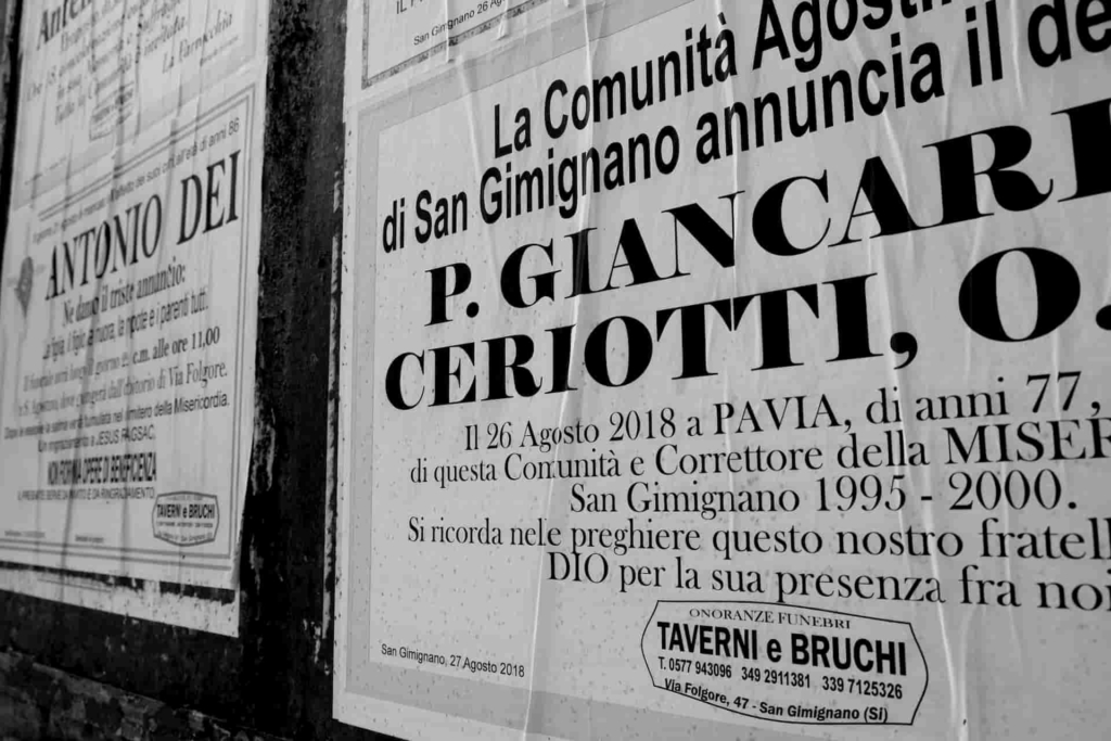
The Fix on Fonts
On the more visual side of things, paragraphs should all be aligned left. Justified text is harder to read, and our goal is to make this experience as easy and seamless as possible for target users. Line height should always be greater than the size of the text itself. A good rule of thumb to follow is to scale font and line-height in multiples of four pixels. This will ensure your content has an open, breathable feel.
Further, it is also a good idea to keep the number of unique fonts you use to less than three. Too many fonts tend to appear messy, which then creates a confusing appeal to readers. If you stick to three or fewer and make sure they are popular and easily readable, you’re sure to provide a pleasant experience. Most sites use sans-serif fonts since they’re a little less ornate than the serif fonts such as Times New Roman, but it comes down to your interface’s theme and definition.
Today, most systems are set to a finite default that automatically creates these fonts, alignment, and line spacing. That being said, it’s always a good idea to make sure your line spacing and kerning are appropriate for copy and consistency. In digital typography, kerning is usually applied to letter pairs as a number by which the default character spacing should be increased or decreased; a positive value for an increase, a negative value for a decrease. You’d be wise not to disregard this as a minor aspect as you’ll see, once all your text is populated, having mismatched spacing will destroy the synergies of the entire page ruining the underlying design concept you’ve worked so hard to build up until now.
More About Fonts
When deploying headings, you might double the size, although some designers would argue that it is too big and that perhaps 25% is sufficient. It’s a personal preference but one to consider. For example, if your body text is 14pt, you would use 28pt for the headline if you were to double or 21pt at 25%. If you are looking for enhanced drama, you could also try 3x or 4x to create a stark contrast. When creating a title, it would be best to stay away from regular fonts; it’s boring and doesn’t compare and contrast with the body copy well. Use bold or a lighter outline.
Don’t forget about aligning to one axis. Always build your type along one primary axis, and align each of your elements to this axis. It’s not a good idea to place elements along the edge or corners of an interface unless you are deliberately trying to portray an appearance of cutting the elements or suggesting that part of the design goes off the page. Further, negative space, or white space as it is often called, is the area of your layout that is intentionally left empty or blank. Negative space is not only found around various objects, but it is also space in between or inside them. Negative space provides an area of breathing room that often attracts other objects on the page or screen. Despite its “negative” connotation, “negative space” is a good thing; let your design breathe.
Spacing matters. The closer you place elements together, the more the reader will assume a relationship exists. Many times this assumption is created between separate blocks of information.
When selecting a font, it’s important to remember that words should never distract the user from completing the primary Call-To-Action and occupy too much sensory perception at a given time. Fonts should pop just enough to make a point but not be too overwhelming to take away from the primary design purpose. Similarly, the font should be flexible insomuch that it will render properly on all devices.
In summary, when it comes to typography, the following are the pitfalls you should be aware of:
- Using too many fonts. It is advisable not to use more than three fonts on any one website. If you intend to use more than three, be prepared to justify the reason/necessity.
- According to Google’s Material.io, your body copy’s text size should never be less than 10px. Typically, 14-18px is used for the body of work. Font size must be specified in full numbers, not fractions.
- Text styles, including font size, kerning, leading, and color, should be consistent throughout the product.
- Leading must be larger than the font-size: In typography, there are various definitions of leading; however, the most common usage of the word refers to the space between two lines of adjacent text.
- The length of the text block should not exceed 600px. A text block is defined as an area of text that is not a heading or a body paragraph. The privacy line, copyright data field at the bottom of most websites, would be considered a text block. If you need to expand the text block length, you should increase the leading.
- A few instances notwithstanding, your copy should always be aligned flush left. Should you decide against aligning your work with the left, be prepared to explain why you have abandoned traditional expectations.
- To avoid copyright/trademark/plagiarism infringement, it is recommended that you only use fonts from the free resources that permit widespread commercial use or fonts that you have purchased with a license that accounts for intended use.
Looking for inspirations:
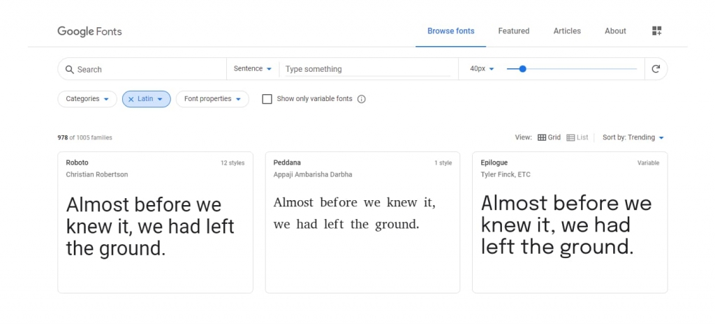
- https://fonts.google.com
- https://fontstorage.com/
- https://fontpair.co/ is recommended for selecting font pairs.
- https://viljamis.com/2016/typography-for-user-interfaces/
- http://typ.io
Artful Science
By now, if we’ve done our job, you should realize that typography isn’t highly complicated. The bottom line is that while it’s not difficult, it is quite easy to get carried away when working with typography. As with most elements in digital design, it’s always best to defer to simplicity and consistency. Buttons and links should render in matching colors, and your text blocks should be relatively evenly-sized and spaced, etc. The purpose is to create an environment that visually stimulates the reader and then drives home your key messages.


