Color Palette Guidelines
Unlocking the Power of Color Harmony
Color is a fascinating element that derives its meaning from the context in which it is used. Rather than having inherent meaning on its own, the value of a color is determined by its relationship to other colors. For example, placing a light figure on a white background creates an impression of lightness and gentle warmth, while placing the same figure on a black background elicits a colder and more aggressive demeanor.

For better or worse, personal preferences, experiences, cultural differences, and context often distort the meaning that individual colors provide. Each human perceives colors subjectively based on their unique context, which depends entirely on the conditions of use. To each their own. Some users will prefer certain colors and dislike others. And, this is unpredictable. Color is not verbal or rational. It’s contextual and emotional.
Decoding Color Harmony
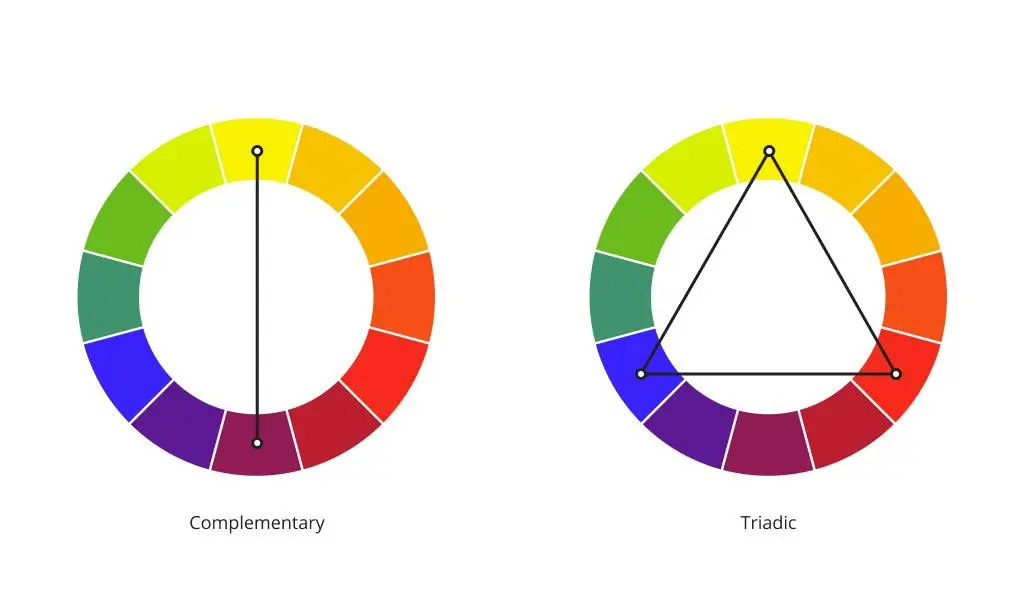
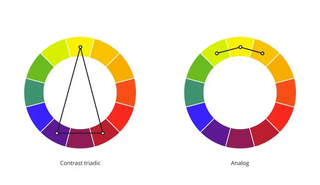
Often, when communicating about color harmony, people rely on subjective feelings based on their personal experience. In reality, color harmony is an objective regularity. Color Theory, dating back to the 18th century, tells various visual stories. We do know that color harmony is present when in equilibrium when the asymmetry of various forces combines. Complementary colors create this balance. The color gray is an exception; it is neutral, essentially colorless. The human eye does not conjoin any additional color to it. In the visual arts, not to be confused with vision science or colorimetry, we use the color wheel as our guide towards achieving harmonious combinations. Various color ordering systems have been created over time, but most reflect the same underlying principle. Among the most popular systems used in Digital Design today is the color wheel with the color circle and triangle of primary colors (image below). The opposite colors in this circle are сomplementary.
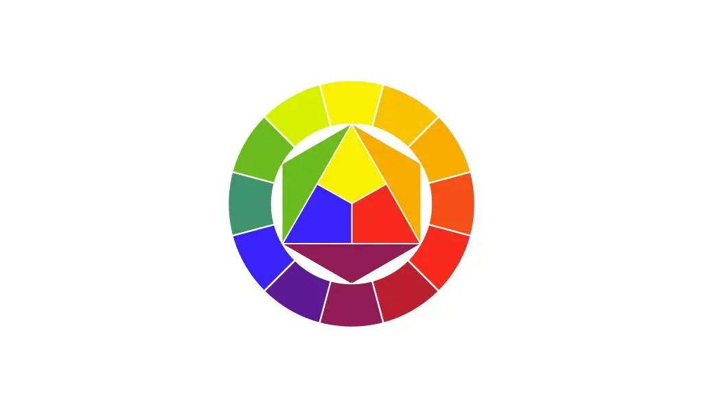
The quantitative ratio of colors is important in achieving proper color composition. All combinations of colors in the twelve-colored circle, each connected to the others through an equilateral or isosceles triangle, squares, and/or rectangles, make them harmonious.
These figures can be rotated within the circle and all combinations will remain harmonious.
The Role of Color Contrast
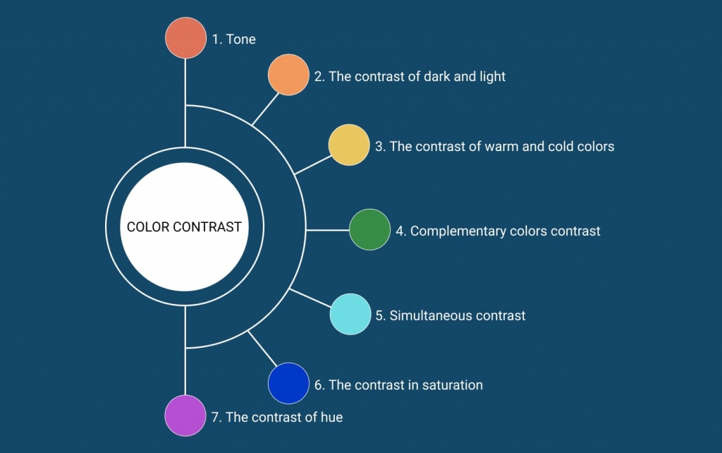
Color contrast serves as a vital component in visual compositions, playing with our visual perceptions. It encompasses the following seven aspects:
- Tone Contrast: The interplay between light and dark shades.
- Light and Dark Contrast: The contrast between light and dark shades.
- Warm and Cold Colors: The contrast between warm colors (orange, red, yellow) and cold colors (blue, violet) or a combination of both, depending on the dominant appearance of warmth or coldness.
- Complementary Colors: The striking contrast between colors positioned opposite each other on the color wheel.
- Simultaneous Contrast: How one color can alter our perception of another when placed side-by-side.
- Saturation Contrast: The interplay between rich, pure colors and faded, muted colors.
- Hue Contrast: The contrast between undiluted colors in their most intense luminosity.
How to Create Your Color Palette?
Crafting a captivating color palette starts with selecting a primary color that will serve as the core of your brand’s design elements.
Here are some tips to guide you:
- Leverage Existing Elements: If the client already has an established color scheme, use it as a foundation while infusing your own creative touch.

- Stand Out from Competitors: Develop a unique set of color tones and schemes that set your brand apart and avoid confusion with competitors.
- Understand Your Target Audience: Tailor your color palette to resonate with your intended users. Consider their preferences and perceptions to create a visually appealing experience.

- Embrace Originality: Break free from conventional assumptions and explore new concepts and approaches to color selection. Unleash your creativity to craft a distinct and memorable identity.

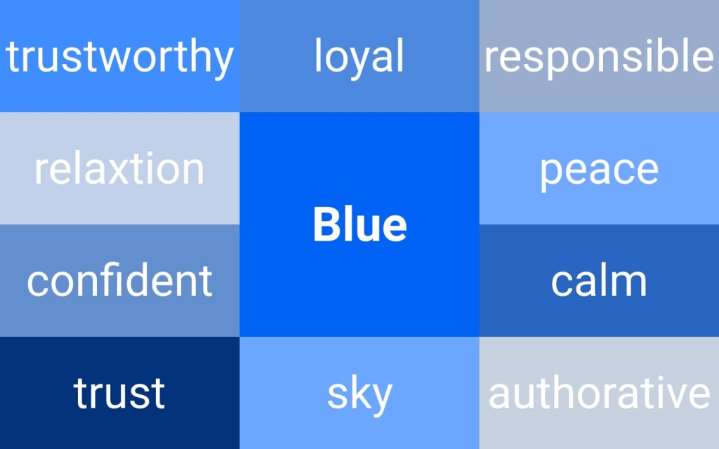
- Wordplay and Associations: Associate words and concepts that represent your brand with different colors. This exercise can help establish meaningful connections and identify suitable color choices.
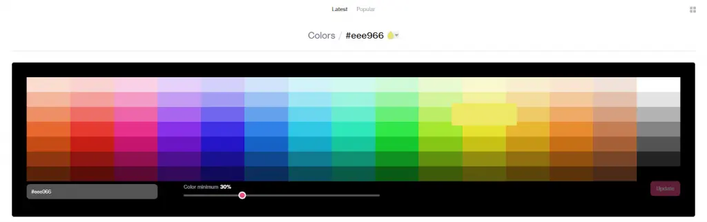
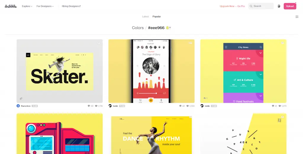
Once you select a starting point, you may visit platforms like Dribbble or Designspiration to help you expand on your concept. Simply enter your primary color’s HEX code into Dribbble and explore the “Colors” section, where you’ll find a palette of colors to choose from. Obtaining the HEX code is straightforward and can be done using online services such as https://htmlcolorcodes.com/. By entering your primary color’s HEX code into these tools, you’ll be presented with examples of use cases featuring similar color schemes. This can serve as a valuable source of inspiration and aid in your decision-making process.
When choosing a shade for your project, it’s important to consider its relevance and the desired brand image. For a fresh and vibrant brand, brighter shades may be more suitable, exuding energy and dynamism. On the other hand, for serious corporate sites, opting for neutral colors tends to work best. The choice of shade plays a significant role in conveying the desired message and evoking the right emotions.
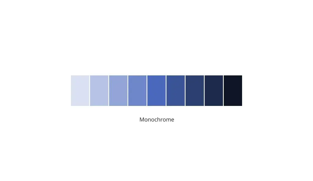
Selecting Shades and Tints
Once you have chosen a primary color, it’s time to explore various shades and tints that will complement your palette. Seek inspiration from other appealing designs and use eyedropper tools to extract specific shades. Remember to strike a balance when incorporating neutral colors, as too many can dull the overall design.
Most color palettes contain more colors than what is immediately visible to the naked eye, often including more options than you would ever need or use. When it comes to brand identity, it is common to incorporate three neutral colors into the overall design. Using more than five neutral colors can result in an element that appears too opaque or dull, compromising its effectiveness. The objective is to create an attractive and engaging brand representation that visually communicates the essence of the entity it represents. This doesn’t mean it should be flashy, ornate, or loud; instead, it should convey a meaningful graphic illustration. Depending on the specific requirements, a brand palette may consist of three colors, but in most cases, incorporating 4-5 colors or accents is more than sufficient.
The key components of a brand color palette include:
- Primary color
- Secondary color (color accent - see below)
- White
- Dark grey
- Light grey (not always necessary)
There are various websites available to help you identify appropriate accent colors. For example, you can visit ColorSpace and enter the color code associated with your primary color, which you obtained from Dribbble. By clicking “Enter,” the site will provide you with complementary accent color schemes to consider and use as inspiration.

The color gray is extremely versatile and commonly used in web projects, particularly to highlight other colors. The dark shade of gray is often employed for text, while the light grey shade is used to create borders, typically against a white background.
Useful Resources
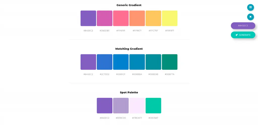
- https://mycolor.space/ — color palette generator
- https://color.adobe.com/ru/create/color-wheel/ — color wheel for a palette
- https://coolors.co/ — random palette generator
- http://colorhunt.co/ — a collection of color palettes
- https://material.google.com/style/color.html — primary material colors
- https://www.materialpalette.com/blue/yellow — material palette based on 2 colors
- http://material.colorion.co/ — material style palette
- http://www.flatuicolorpicker.com/all — flat colors
- http://swisscolors.net/ — swiss colors


