Referencing in UX/UI Design
Creative Middle-Ground
References are a powerful tool in the world of UX/UI design, offering a unique way to understand your clients’ tastes and expectations. While everyone desires a website that stands out, it can be challenging to define and express a vision accurately. That’s where references come in. They allow designers to showcase different colors, typographies, compositions, and photography styles, providing concrete examples for clients to review. By exploring these references together, both parties can align their expectations and find common ground.
Finding the right balance is essential when using references with clients. The final stylistic choice often resides in a creative middle-ground, blending your expertise with the client’s preferences. It’s crucial to respect the client’s vision while also leveraging your professional guidance to steer them towards the best design decisions. Striking this balance ensures stylistic satisfaction and professional effectiveness.

A Picture is Worth a Thousand Words
Incorporating a variety of references empowers clients to make informed decisions. It’s your opportunity to showcase the very best examples of effective digital design and leverage your web expertise. By providing a visual library of options, you can transcend the limitations of verbal descriptions and enable clients to see specific styles and layouts in action. Reacting and explaining preferences becomes easier, leading to a more accurate understanding of desired design elements. This approach saves time and resources while ensuring both you and the client are aligned.
Asking a client to describe what they’re looking for can be nebulous. Oftentimes, clients may think they want one look, only to decide against it once they see it applied. Verbal descriptions aren’t foolproof in capturing what’s circling in someone’s head. That’s where references truly shine. By showing specific examples and having clients react and explain their preferences, you can better understand the types of styles they favor. This approach is much more effective than trying to rely solely on words and guesswork. It ensures that you and the client are on the same page concerning design elements, making better use of time and resources.

Web Design Resources and References
To help you find the perfect references, we’ve curated a list of valuable resources:
- Hover States (http://www.hoverstat.es)
- CSS Design (https://www.cssdsgn.com)
- Site Inspire (https://www.siteinspire.com)
- Design Made in Germany (http://www.designmadeingermany.de)
- Minimal Gallery (https://minimal.gallery)
- The Gallery (https://thegallery.io)
- HTTPSTER (https://httpster.net)
- CSS Design Awards (https://cssdesignawards.com)
- Awwwards (https://www.awwwards.com/)
- Dribbble (https://dribbble.com/)
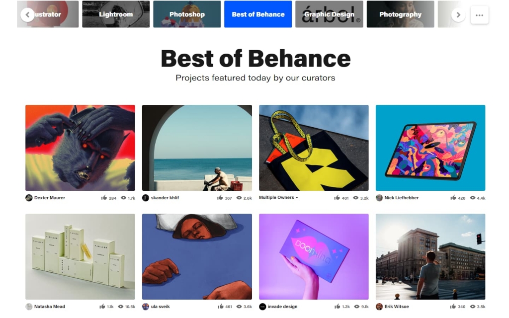
- Behance (https://behance.net)
- Collect UI (https://collectui.com)

When presenting references to clients, be sure to number the images to avoid any confusion. Citing the specific source of each reference is not necessary for clients; their focus should be on determining the layout they prefer.
Web Design Resources and References
References serve as a compass, guiding you toward the precise style that aligns with your client’s preferences. Harnessing the strength of visual examples allows for more effective communication than relying solely on vague descriptions. Once a reference is selected, you can combine your skillset with the client’s specific needs to craft a truly unique website.
In the realm of UX/UI design, referencing opens up a world of creativity, collaboration, and purposeful design decisions. Embrace the power of references and embark on a journey to create remarkable digital experiences for your clients.


